I got in touch with Fifi serendipitously thanks to a short chat with one of my IG followers.
She was happy with my idea, so we agreed to meet in Milan during one of my frequent trips to Italy.
I usually go straight to Turin, but this time I planned my trip so that I would arrive (and depart) from Milan instead. I booked one of those “short stay” hotels near Milan Central Station.
She was happy with my idea, so we agreed to meet in Milan during one of my frequent trips to Italy.
I usually go straight to Turin, but this time I planned my trip so that I would arrive (and depart) from Milan instead. I booked one of those “short stay” hotels near Milan Central Station.
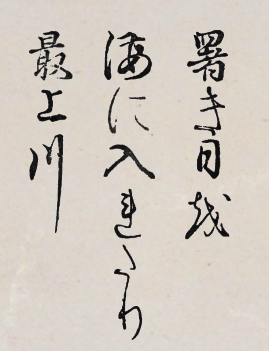
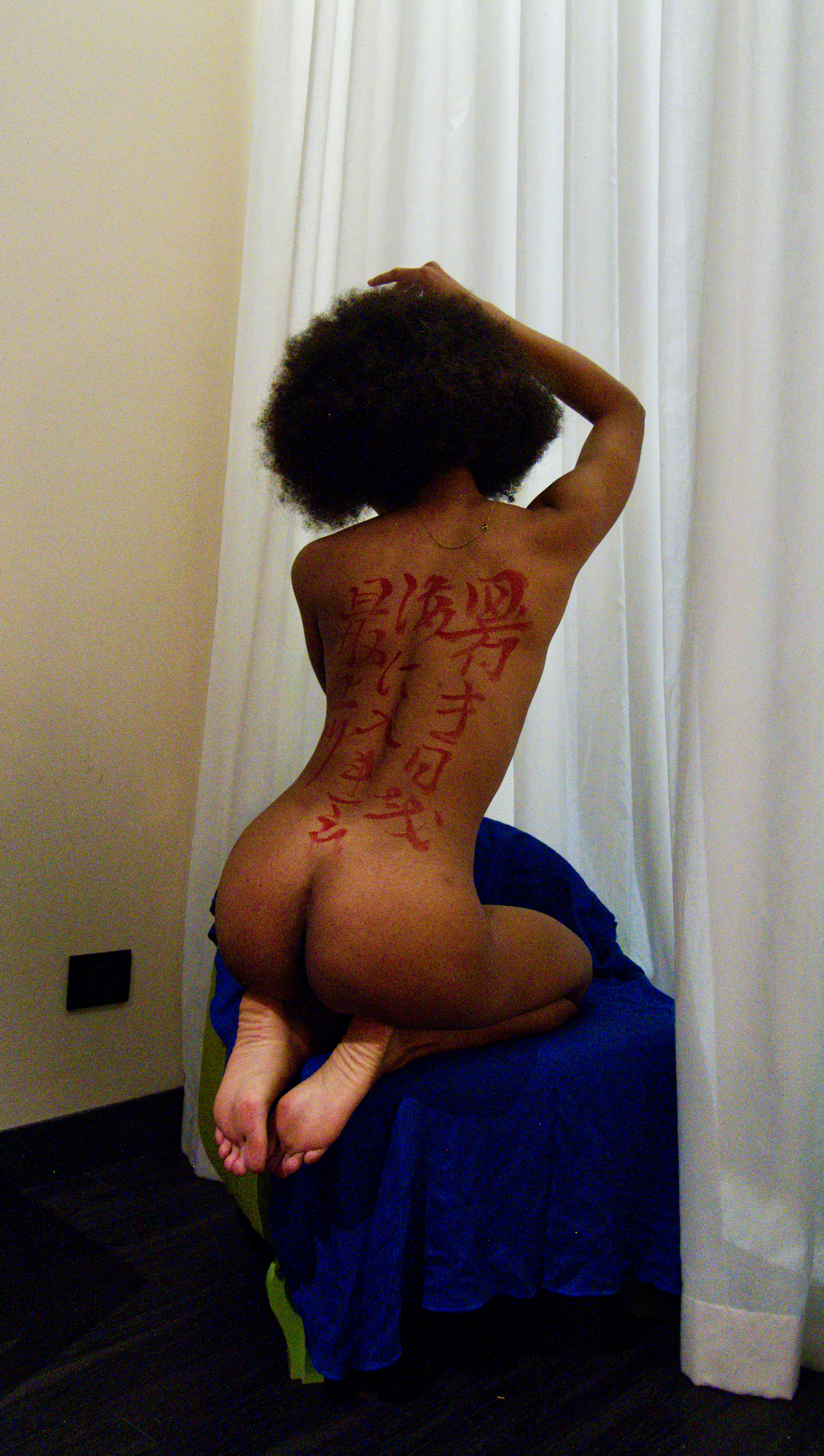
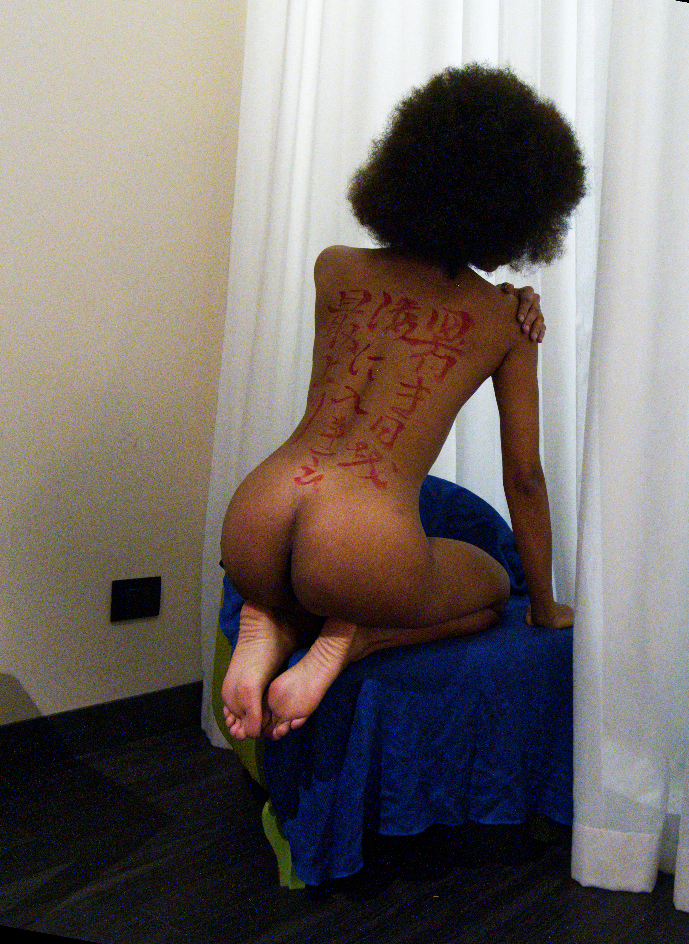
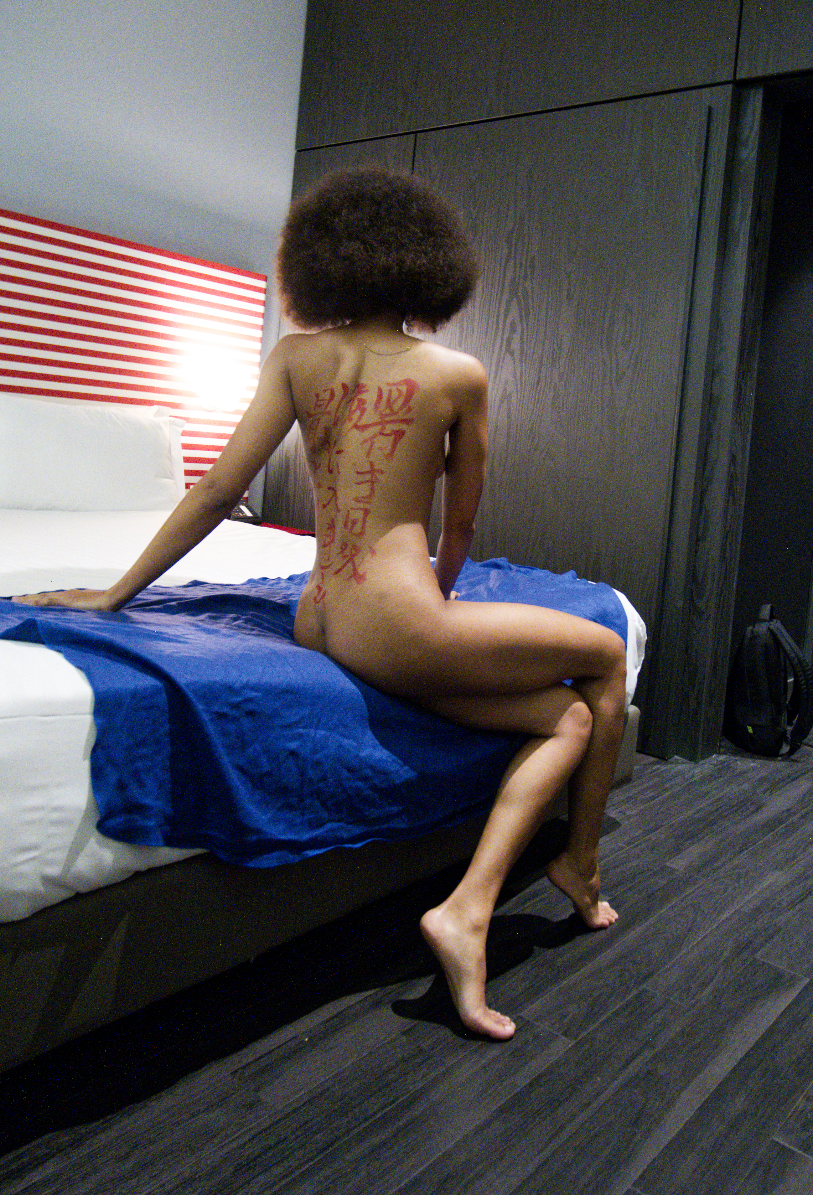
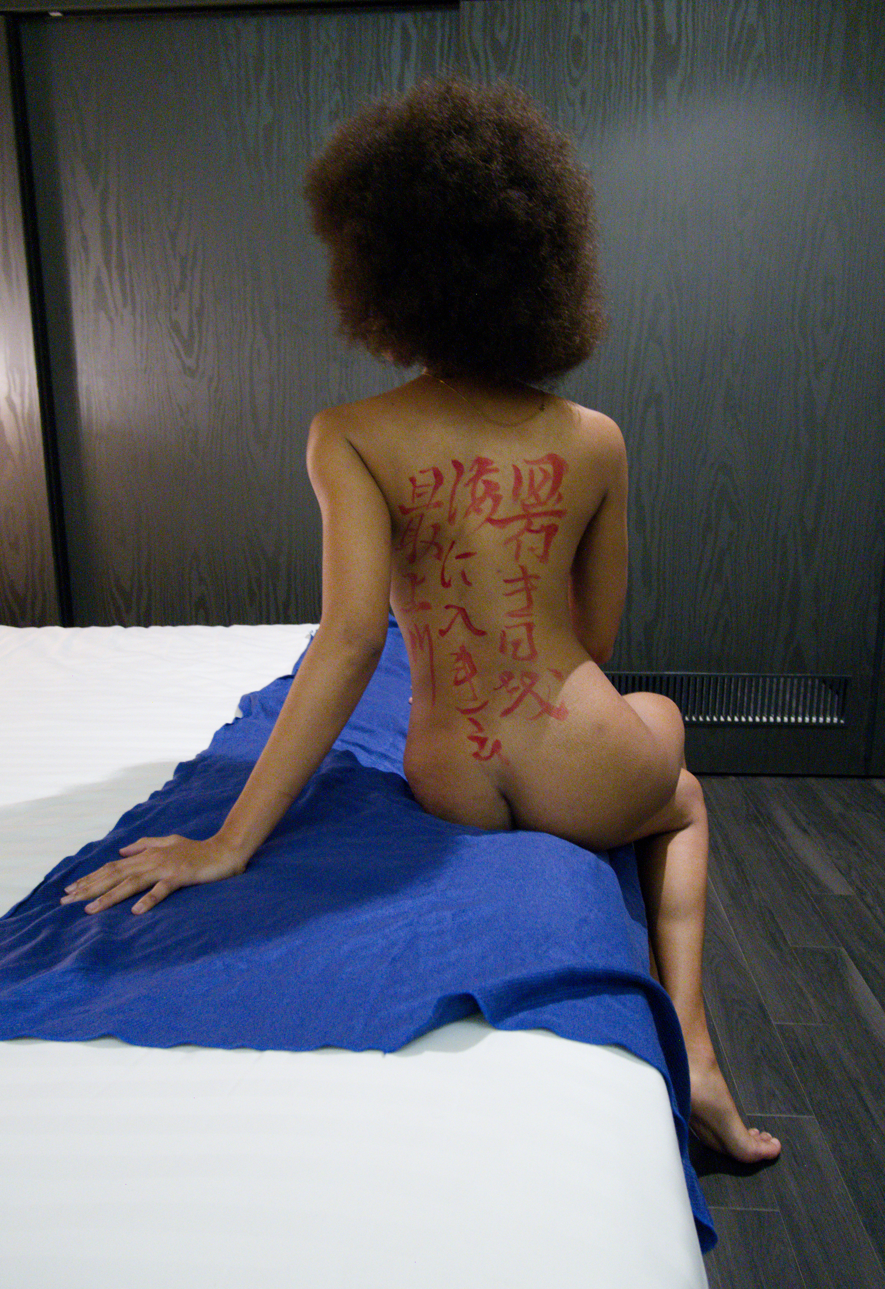
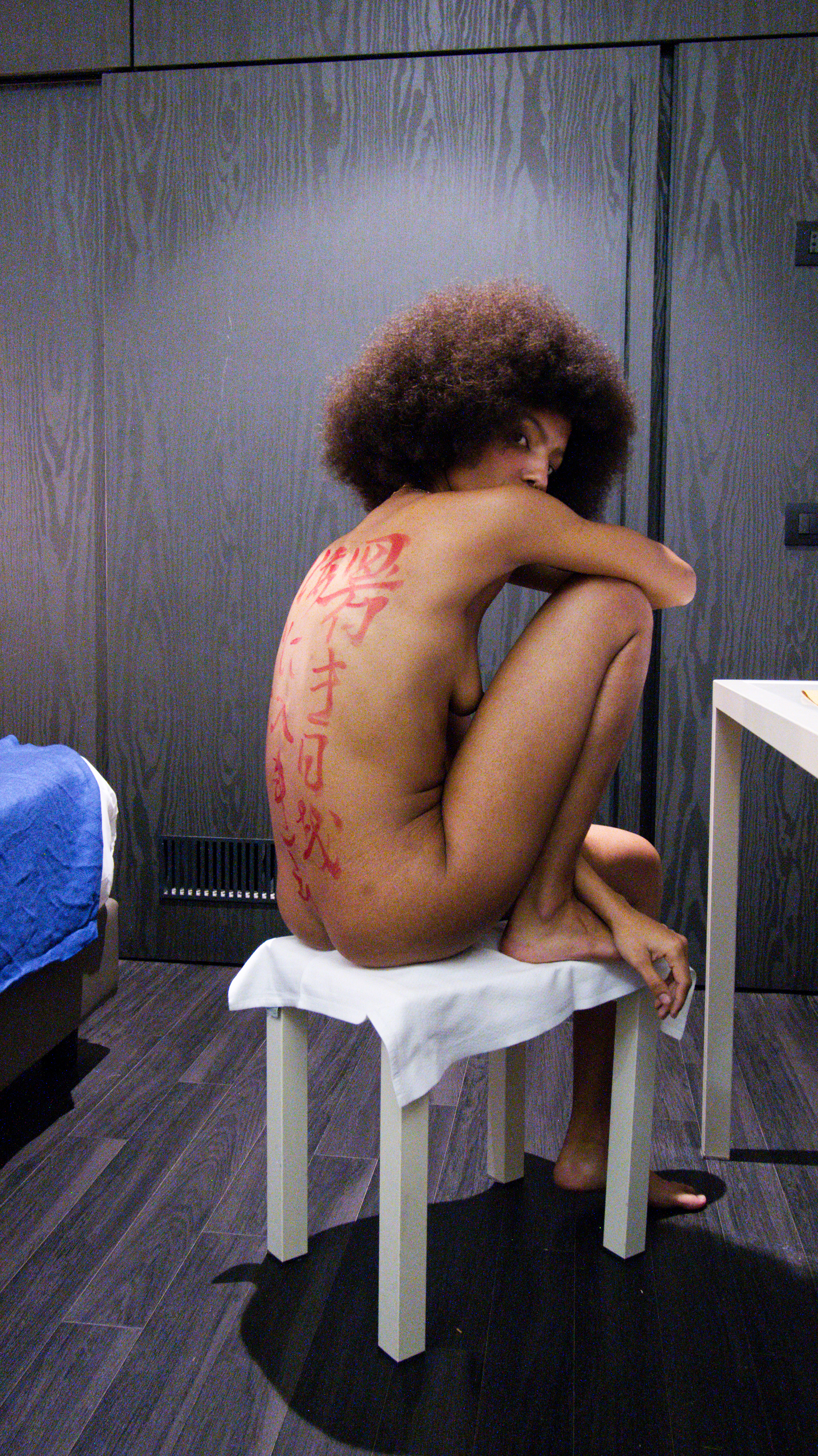
I just discovered there is also a calligraphic mistake in the haiku … the first character on the right should have been "暑", not "署".
Many thanks to 小林 覚 (IG) for pointing this out.
Many thanks to 小林 覚 (IG) for pointing this out.
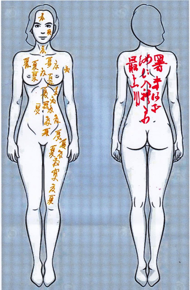
Fifi chose “Summer” as her theme — you can’t go wrong with Bashō; he rarely disappoints:
暑き日を
海に入れたり
最上川
The hot sun was
Set into the sea
By the Mogami River
暑き日を
海に入れたり
最上川
The hot sun was
Set into the sea
By the Mogami River
Preparation Phase
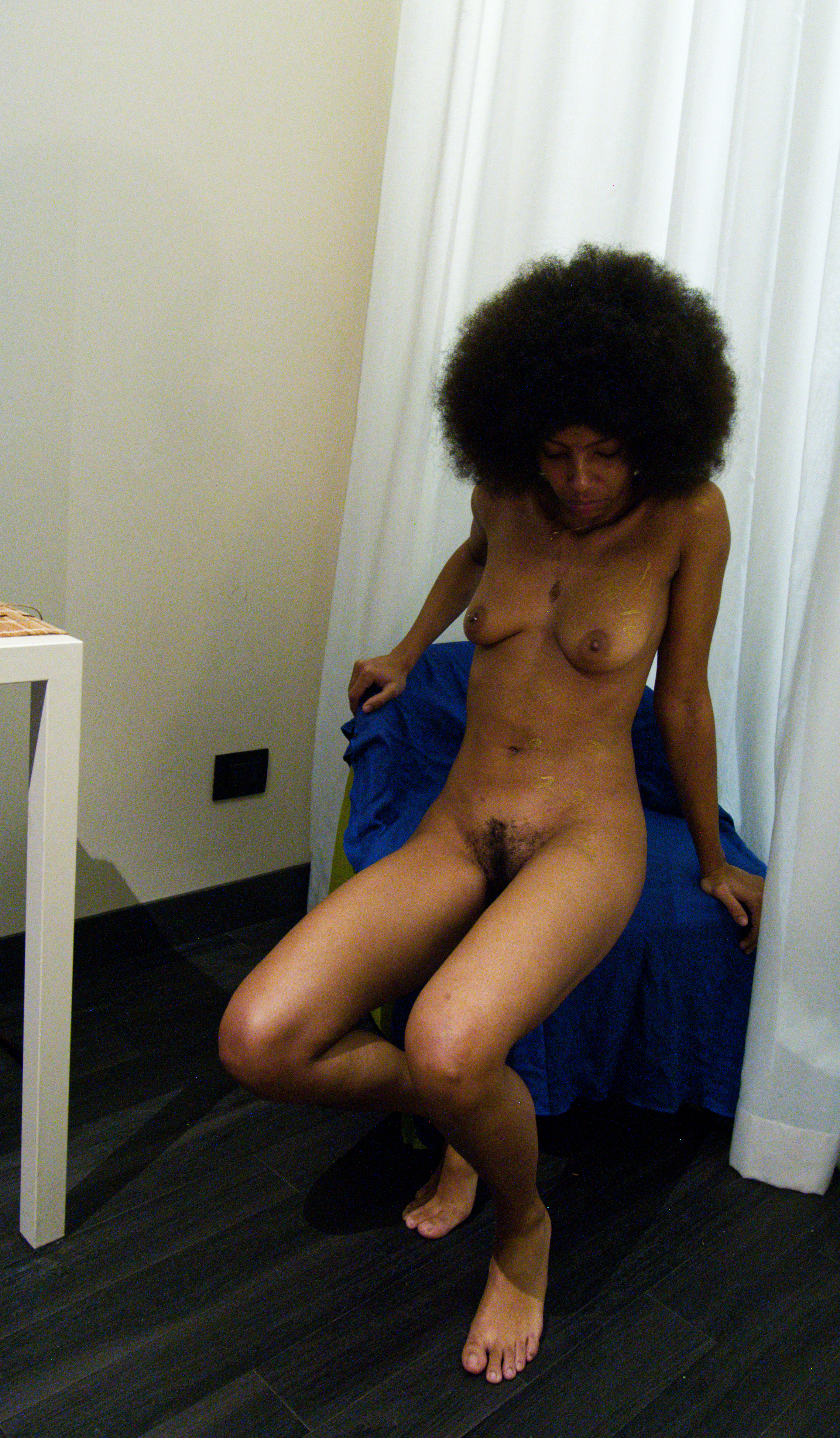
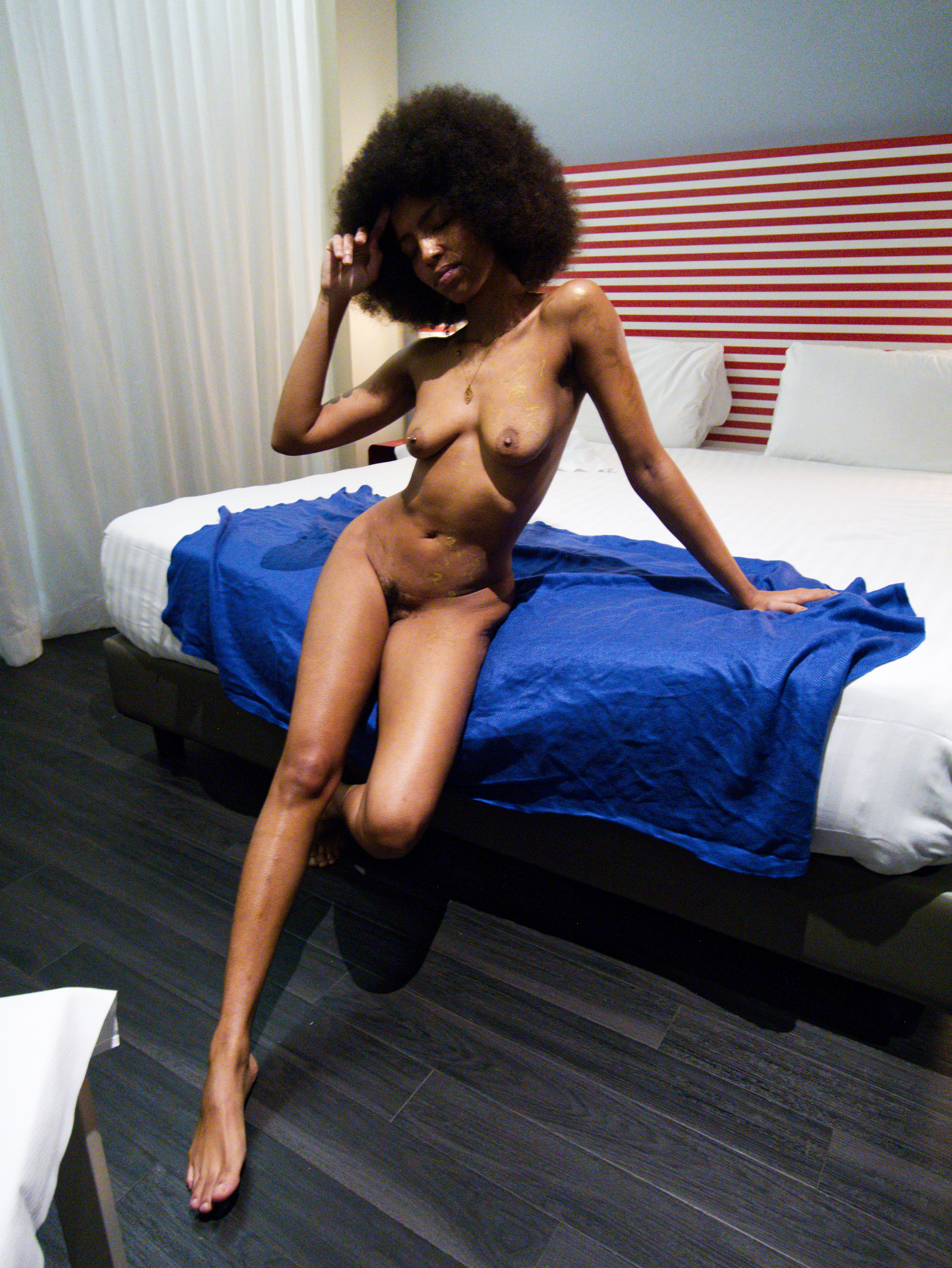
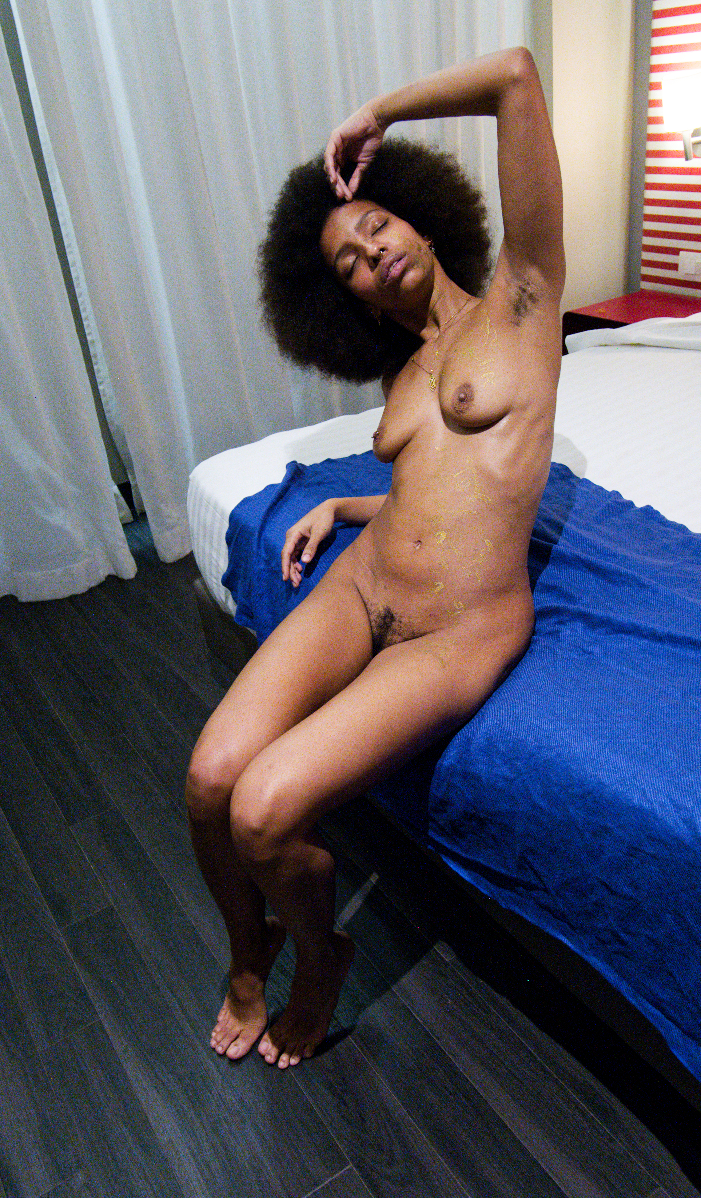
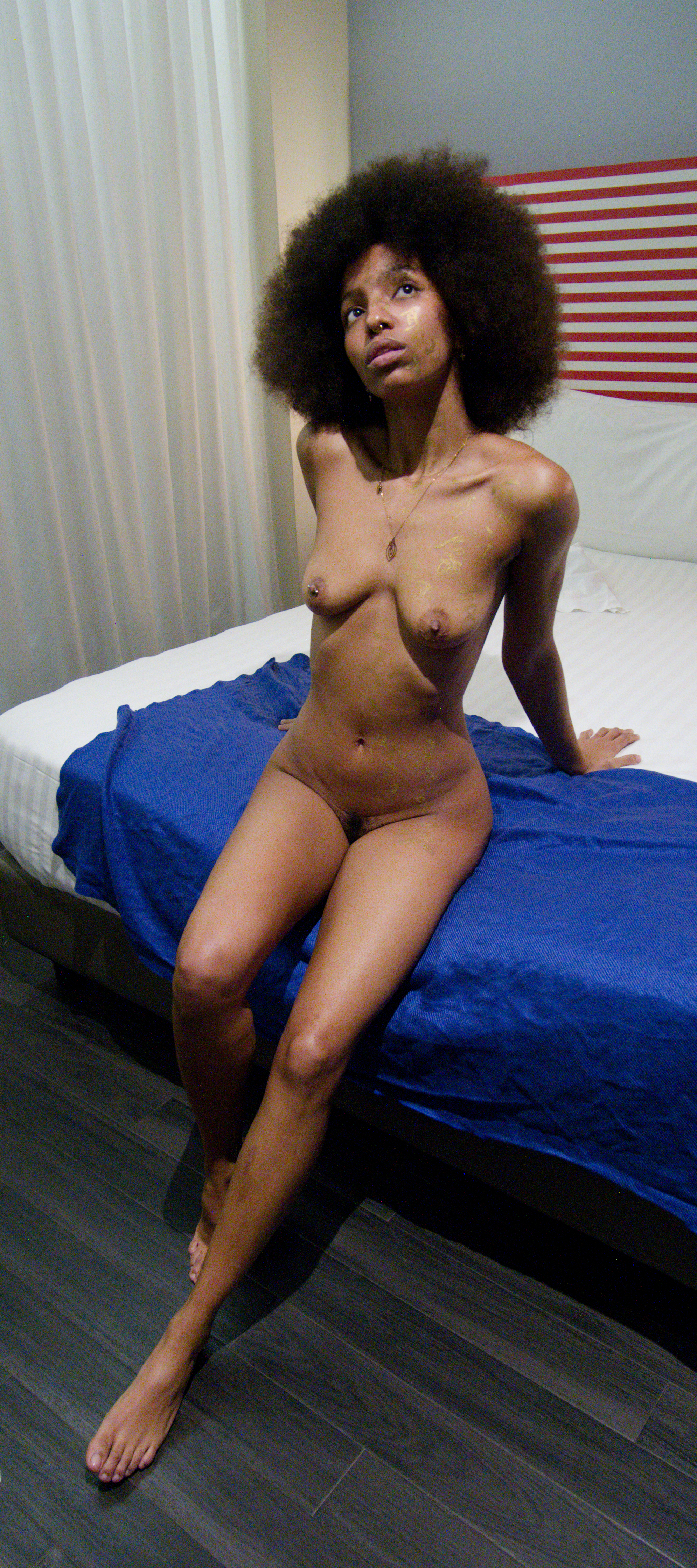
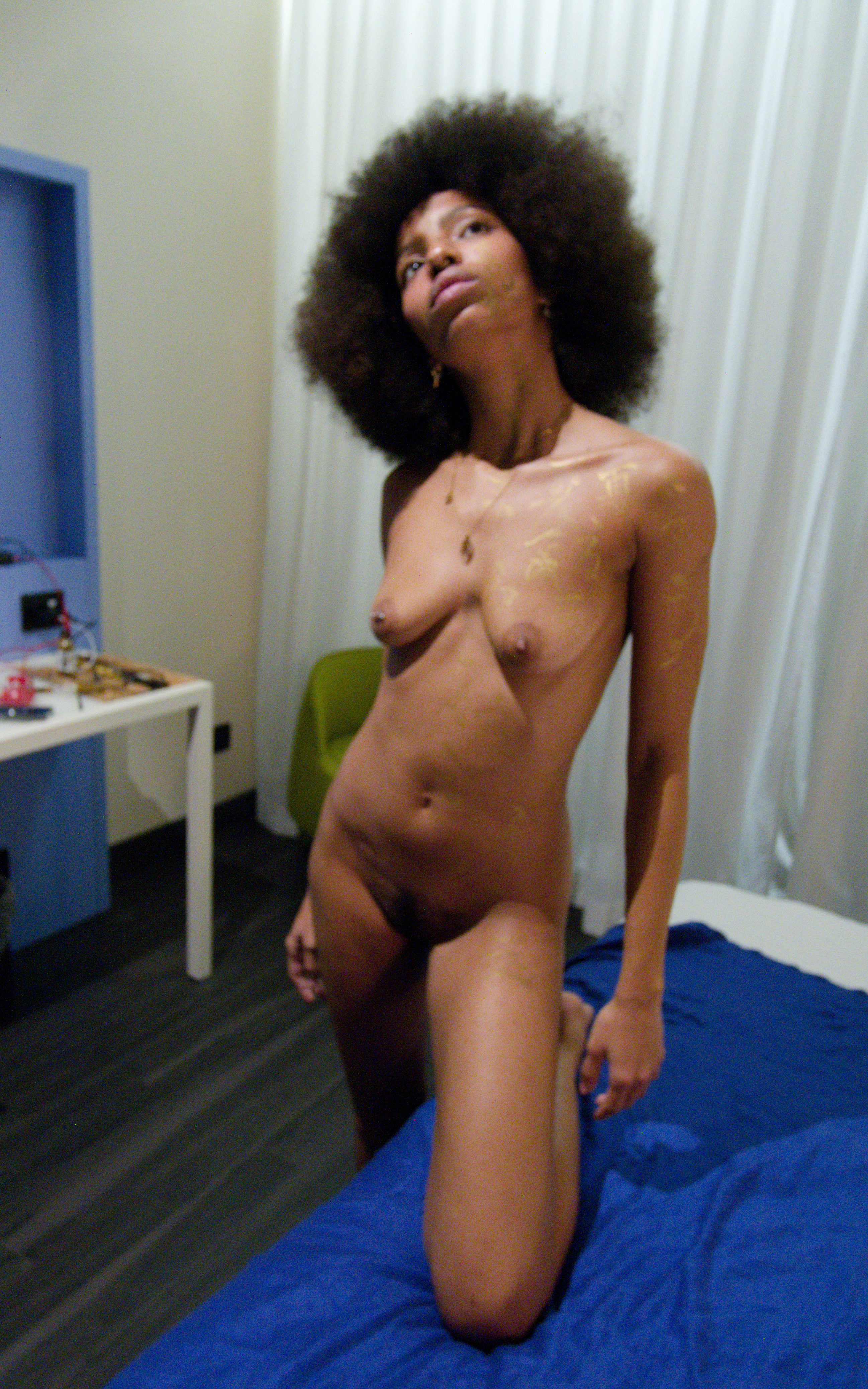
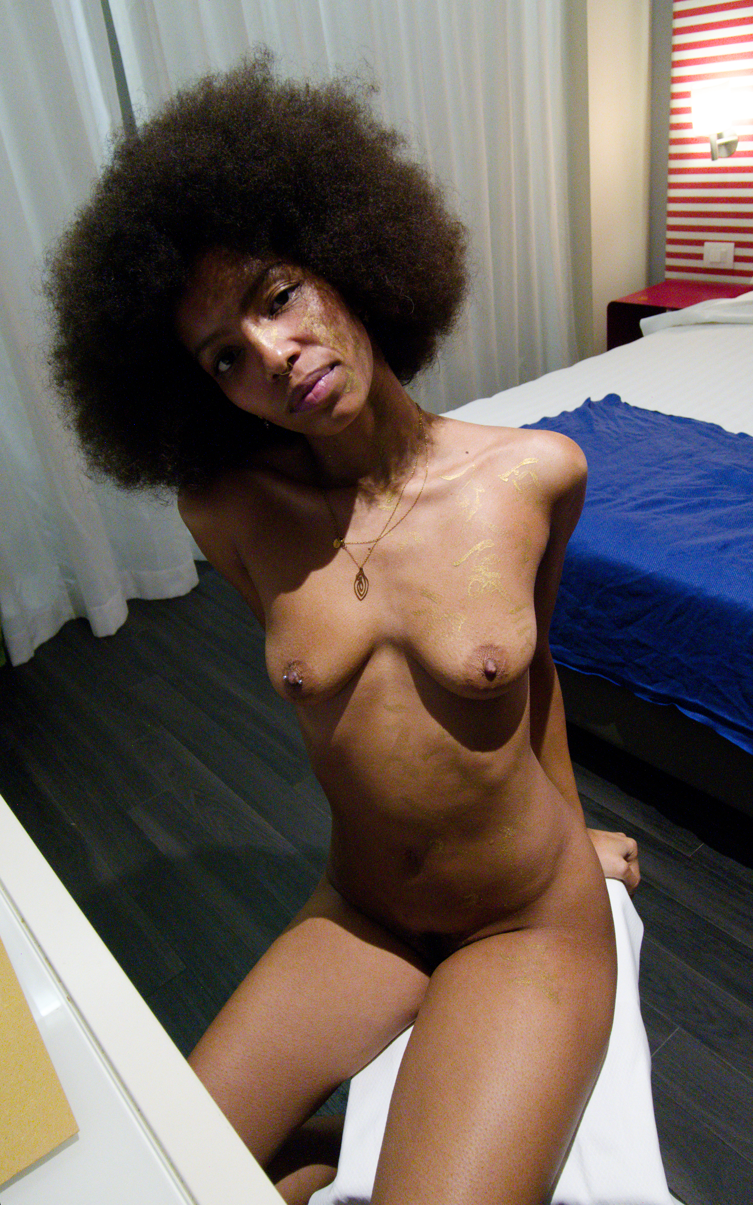
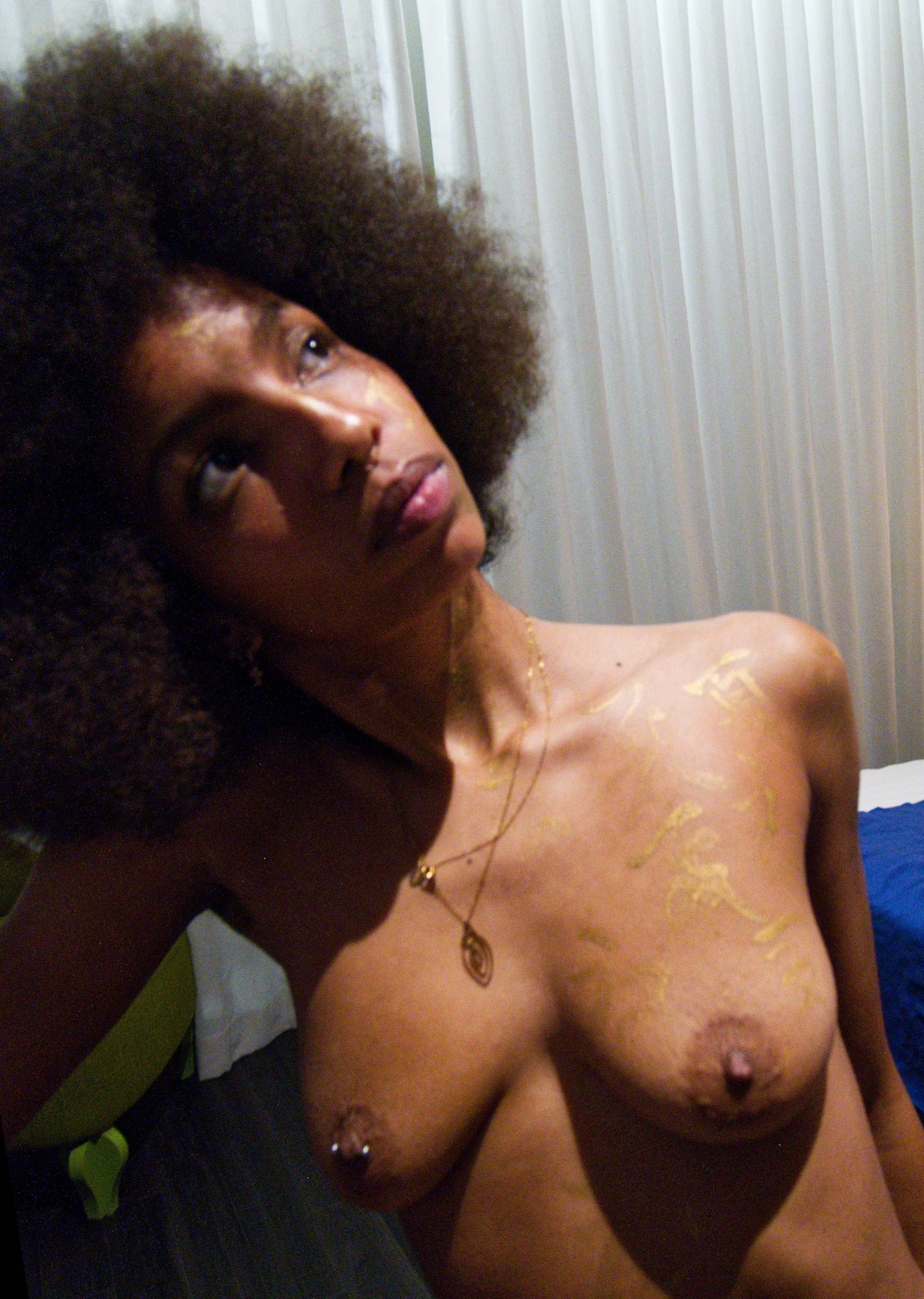
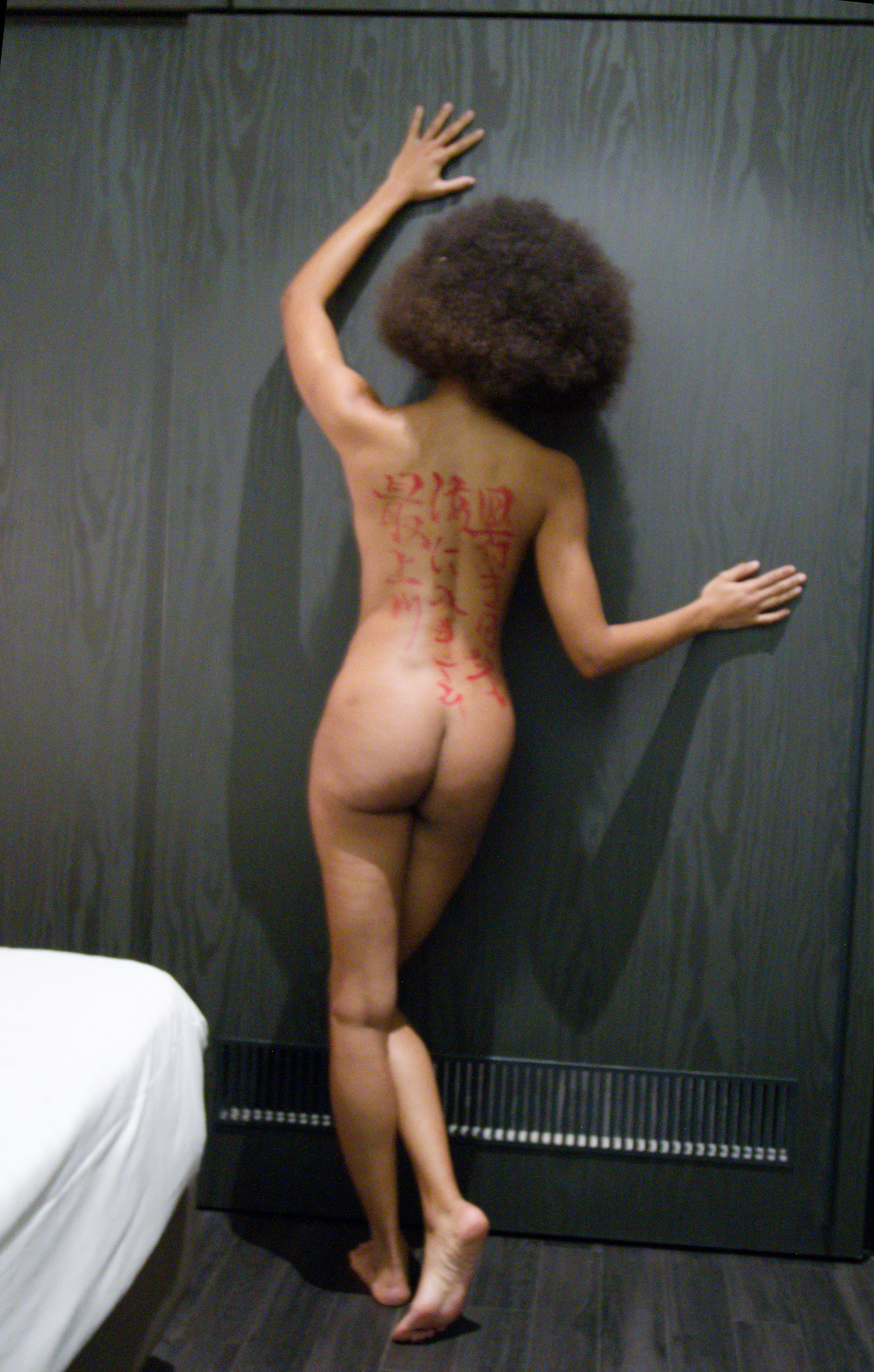
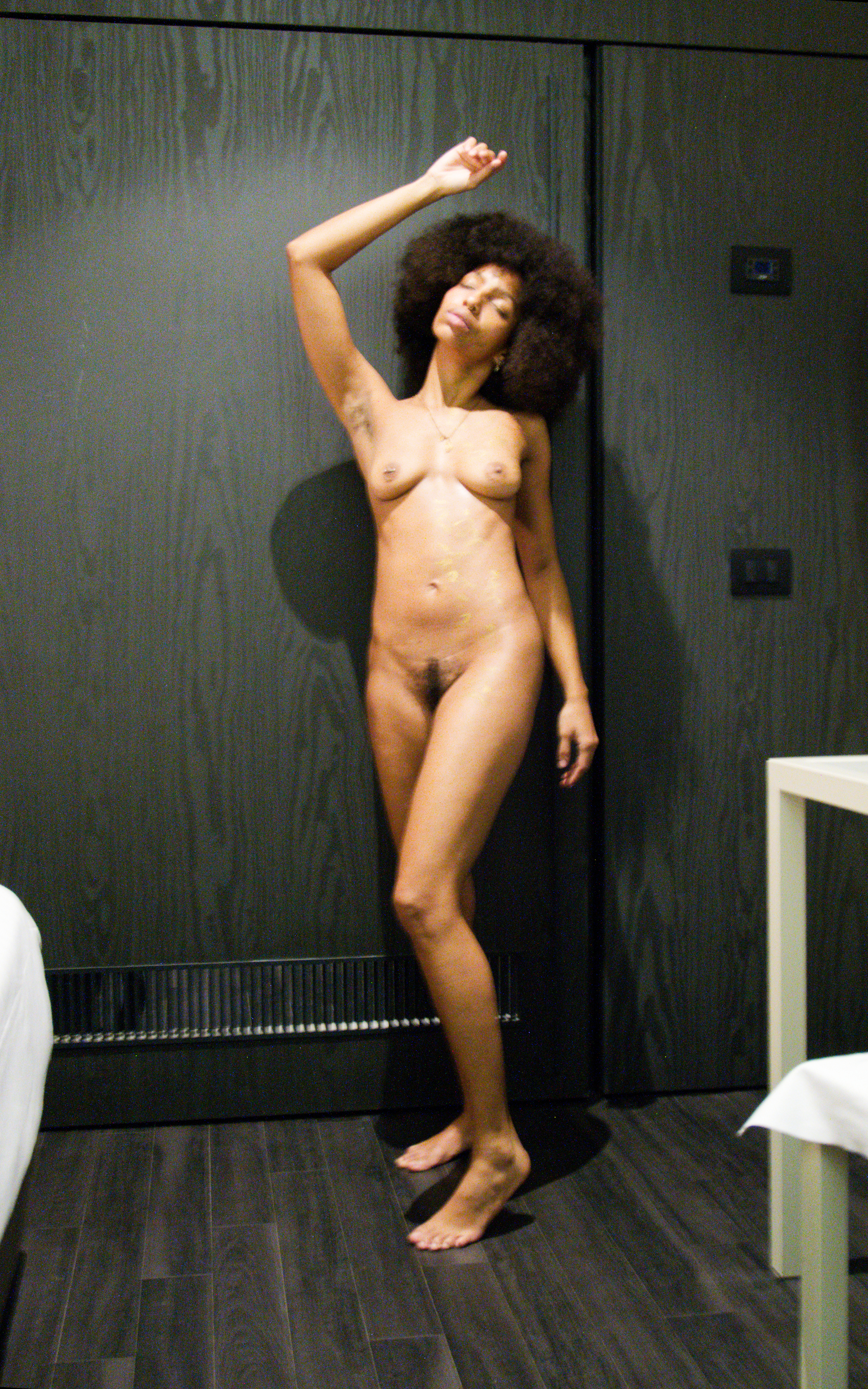
For the theme, I decided to write the haiku on her back, and a multitude of 夏 (Summer) diagonally down her face, chest, and body to her hip.
I decided to use a bit of red ink on the back and gold on the front, expecting this would create a nice contrast with her darker skin tone.
Boy, was that a mistake… :(
I decided to use a bit of red ink on the back and gold on the front, expecting this would create a nice contrast with her darker skin tone.
Boy, was that a mistake… :(
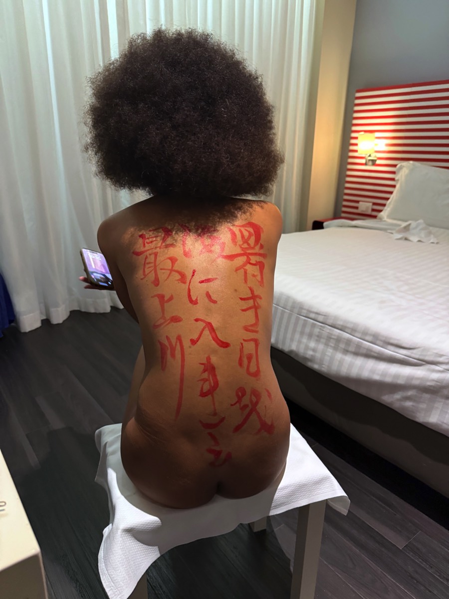
Normally I start with the back, and things looked pretty good.
The main technical problem was that the middle column was a bit too long, so I had to shorten the last kanji.
Overall, I was quite happy with the result, and the red ink looked great.
The main technical problem was that the middle column was a bit too long, so I had to shorten the last kanji.
Overall, I was quite happy with the result, and the red ink looked great.
Apparently there is a calligraphic mistake too, the first kanji on the right should be 暑", not "署".
Many thanks to Sanza Kobayashi for pointing this out to me.
Many thanks to Sanza Kobayashi for pointing this out to me.
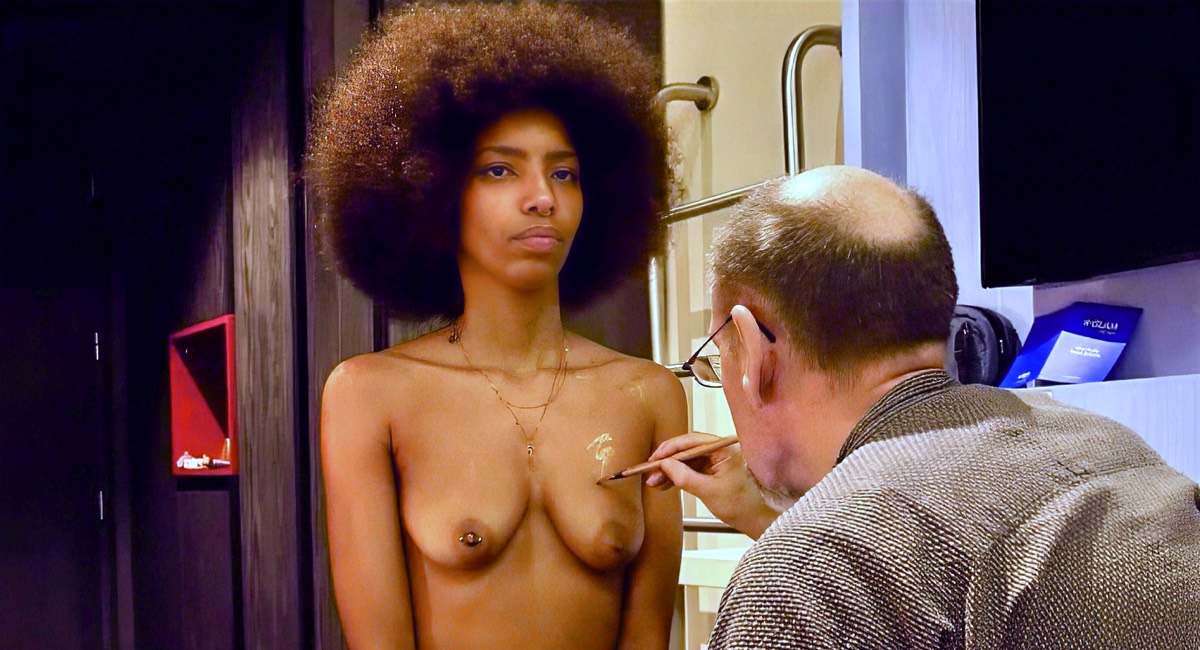
I should have used a smaller brush for writing on Fifi’s face. I normally don’t write on the face itself, and in hindsight I should have experimented on myself first.
But this issue was eclipsed by the bigger mistake. In a sense, even if the kanji size was a problem, nobody would notice.
As you can (not) see here — in a photo taken with my iPhone (the others are much worse) — the gold paint is almost invisible.
But this issue was eclipsed by the bigger mistake. In a sense, even if the kanji size was a problem, nobody would notice.
As you can (not) see here — in a photo taken with my iPhone (the others are much worse) — the gold paint is almost invisible.
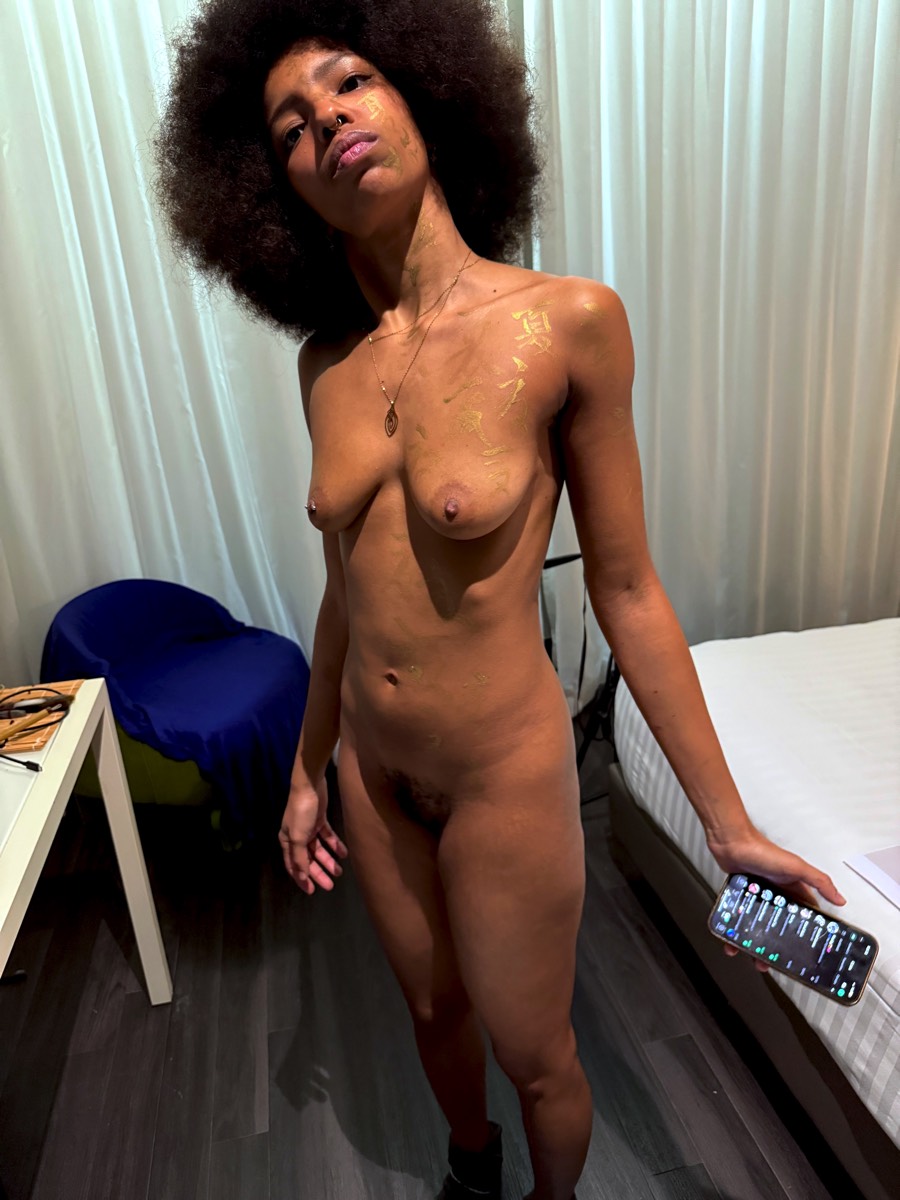
I mostly blame the light in the room itself — the session was around 6 pm in winter, so there was no other light source available.
I realized the problem almost immediately and had brought some black ink, but I still hoped it could be salvaged in post-production. So I carried on, finished the front writing, and moved on to the photoshoot.
I realized the problem almost immediately and had brought some black ink, but I still hoped it could be salvaged in post-production. So I carried on, finished the front writing, and moved on to the photoshoot.
Posing