In 2016 my teacher asked me if I would be interested to participate, along with her and some other students, to to an "International Calligraphy Exhibition" organized every year in Tokyo by International Calligraphy Association.
Basically each artist just needs to write something (in his own preferred style) that fits in one of the accepted standard sizes, then send it to Tokyo where it will be properly mounted and sent back to you after the exhibit.
The idea appealed to me (I am always looking for new challenges, at least in calligraphy) - so I gladly accepted (take also in account that my teacher takes care of most of the stuff, including sending the works there and collecting back at Customs when they come back).
To be honest my first two attempts were nothing to write home about. As it often happens I managed to postpone the actual writing long enough to have to rush it a bit in the end (the fact that I have to go to Berlin to have them sent out is a minor but still relevant part of the problem, too).
On my third attempt I got a random stroke of inspiration, though. A little digression is in order, here. One of the "minor" Japanese arts that really fascinates me is Kintsugi. It is basically a way to repair broken pottery, but instead of striving for "invisible" repairs, in Kintsugi the pieces are put back together with a glue mixed with gold dust, and the resulting effect is that the lines of fracture actually enhance the original piece. |
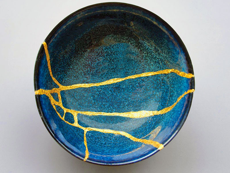
An example of Kintsugi |
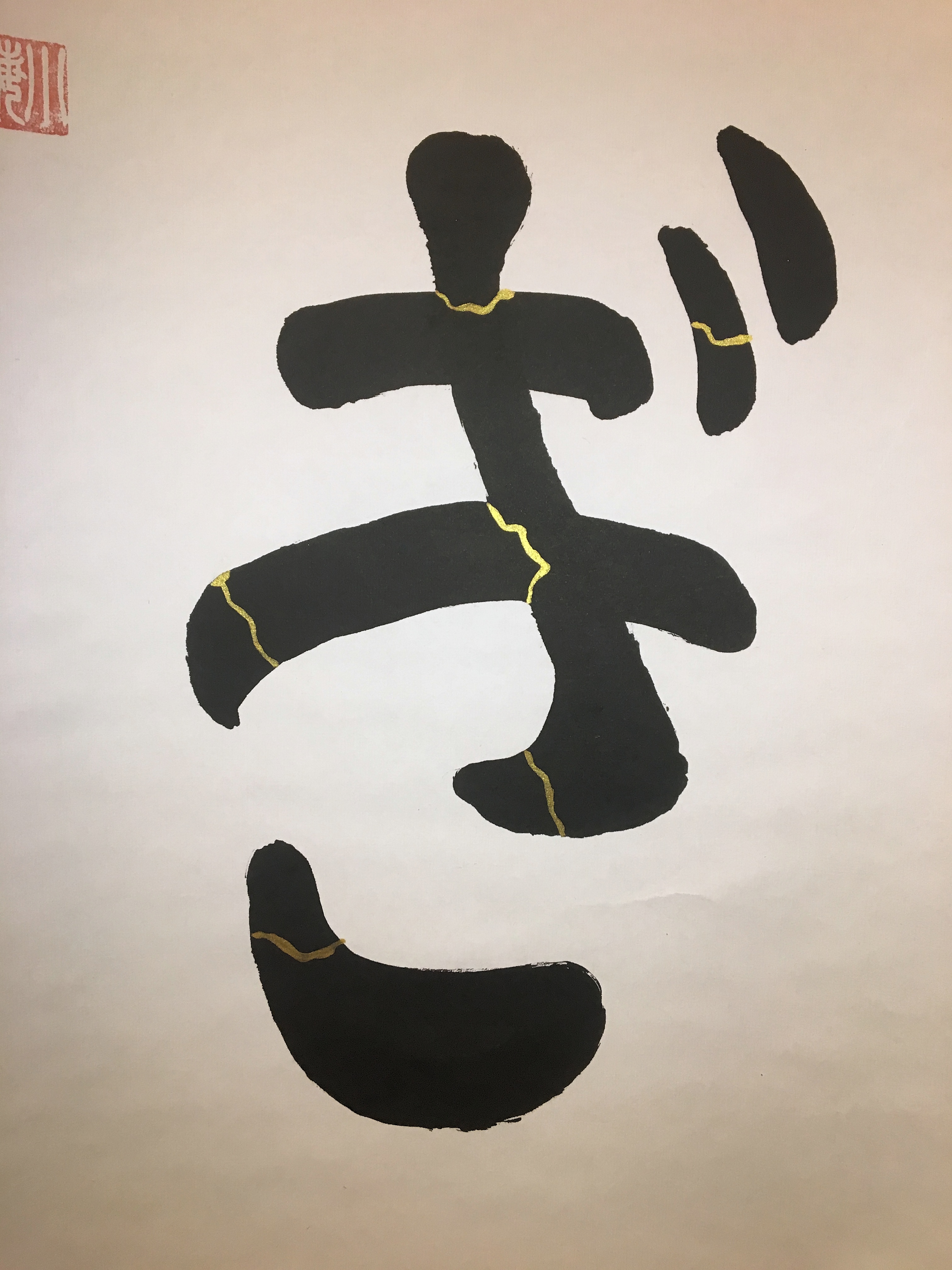
I periodically (albeit infrequently) go online to just look at pictures of this. I am not sure anymore but something like that triggered the inspiration to use 金継ぎ (Kintsugi) as my theme, and besides writing it in ink, to somehow "mimic" the essence of Kintsugi by adding "golden lines" to the calligraphy itself.
Intense experimentation followed: I took some discarded works and started adding lines to these, to find out what type of golden pigment worked best, and also taking inspiration from different Kintsugi pictures to try making the lines "realistic" enough to make the play on words easily understood.
Another element I had to experiment with was which style to adopt for the actual calligraphy. There were two basic problems. First of all the last syllable (ぎ) is not a Kanji, but a glyph from the Japanese syllabic alphabet. Not having any fluency in Japanese makes me always uncomfortable when I have to add Hiragana glyphs to a composition.
An example of Clerical script |
I was therefore extremely pleased with the result... especially when I found out that my work had won one of the minor "prizes" by the judges, as you can see below: |
On top of that, I wasn't very happy with the renditions of the Kanji part, too. This had nothing to do with my own limit as a calligrapher: my problem was that 金 and 継 when written at scale, would look too spindly for something supposedly made of clay.
The solution was simple, but again something way out of my "comfort zone" as a calligrapher: I decided to use so-called Clerical Script, which is inherently more "squat" and with thicker lines.
Needless to say, I have written something in this form maybe 3 times in my entire life, before this…
As usual I created 3-4 versions of my work (plus another 3 in semi-cursive script, just to be on the safe side) and delivered it to my teacher asking her to pick what she considered the best and send it to Japan.
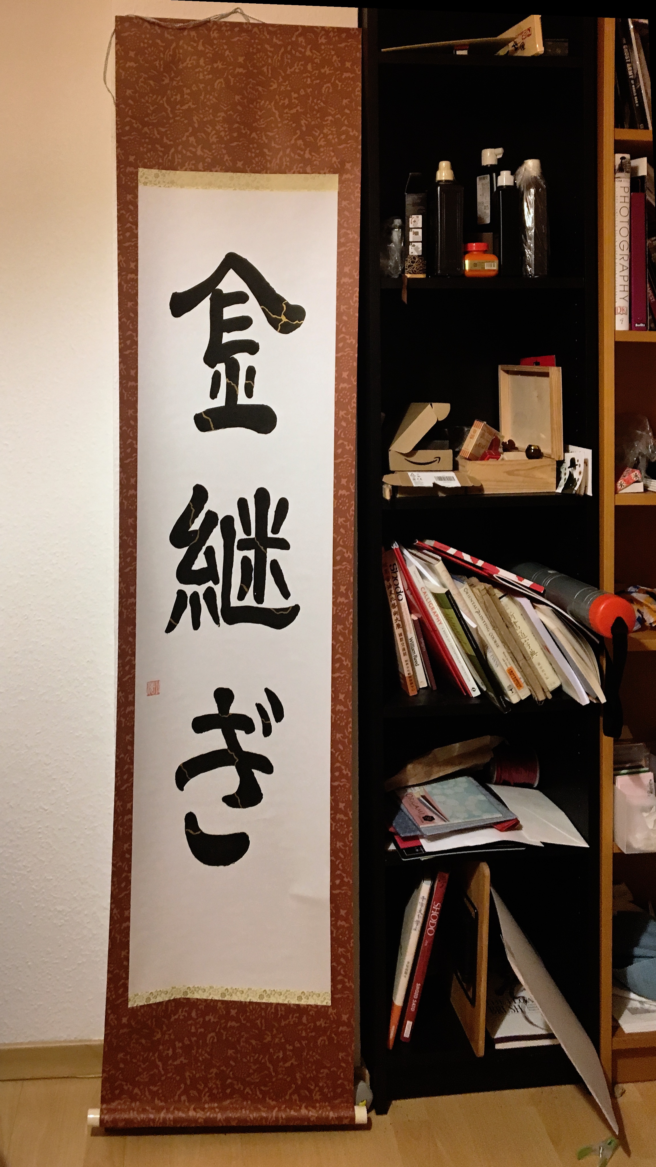
My work, after coming back to Germany
A detail showing the golden lines
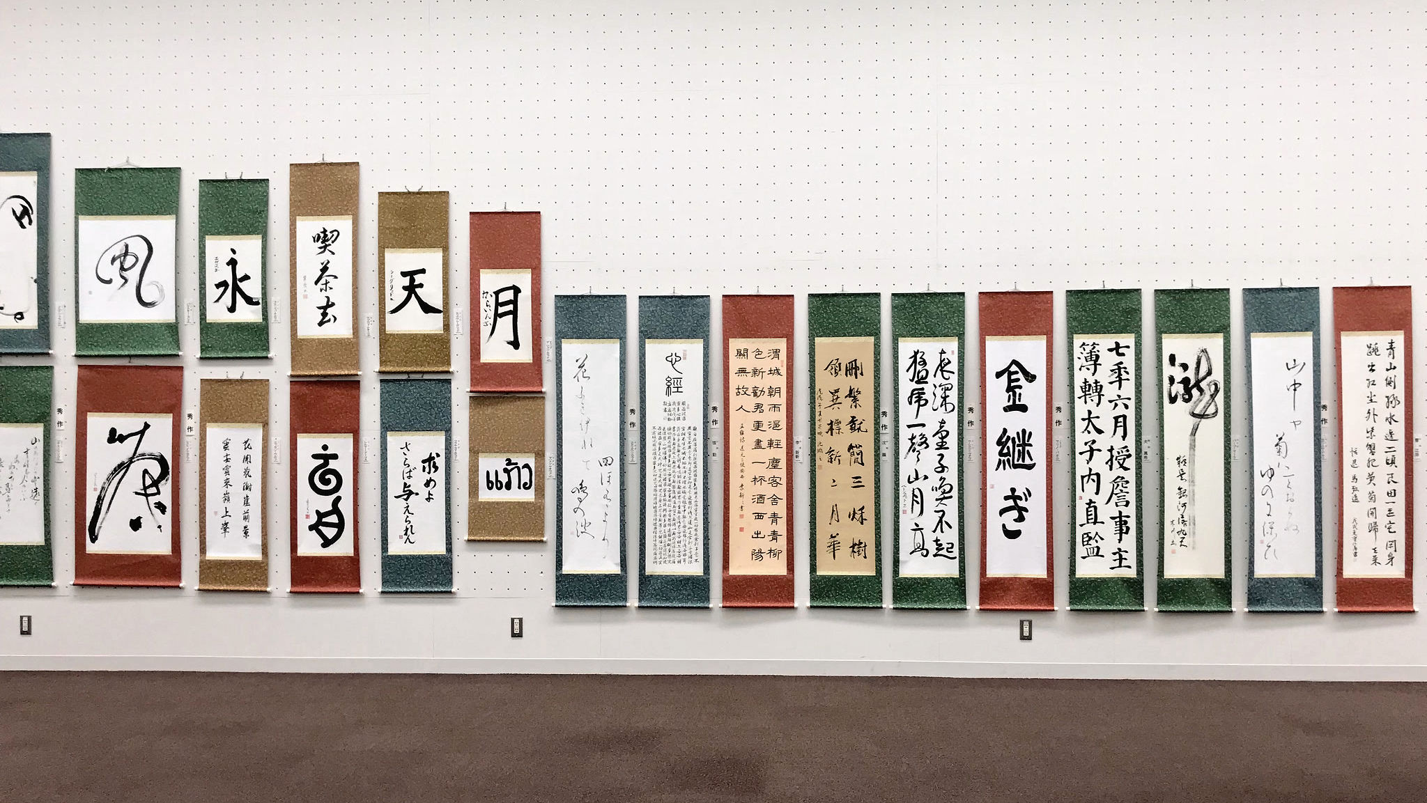
My work at the Tokyo exhibition
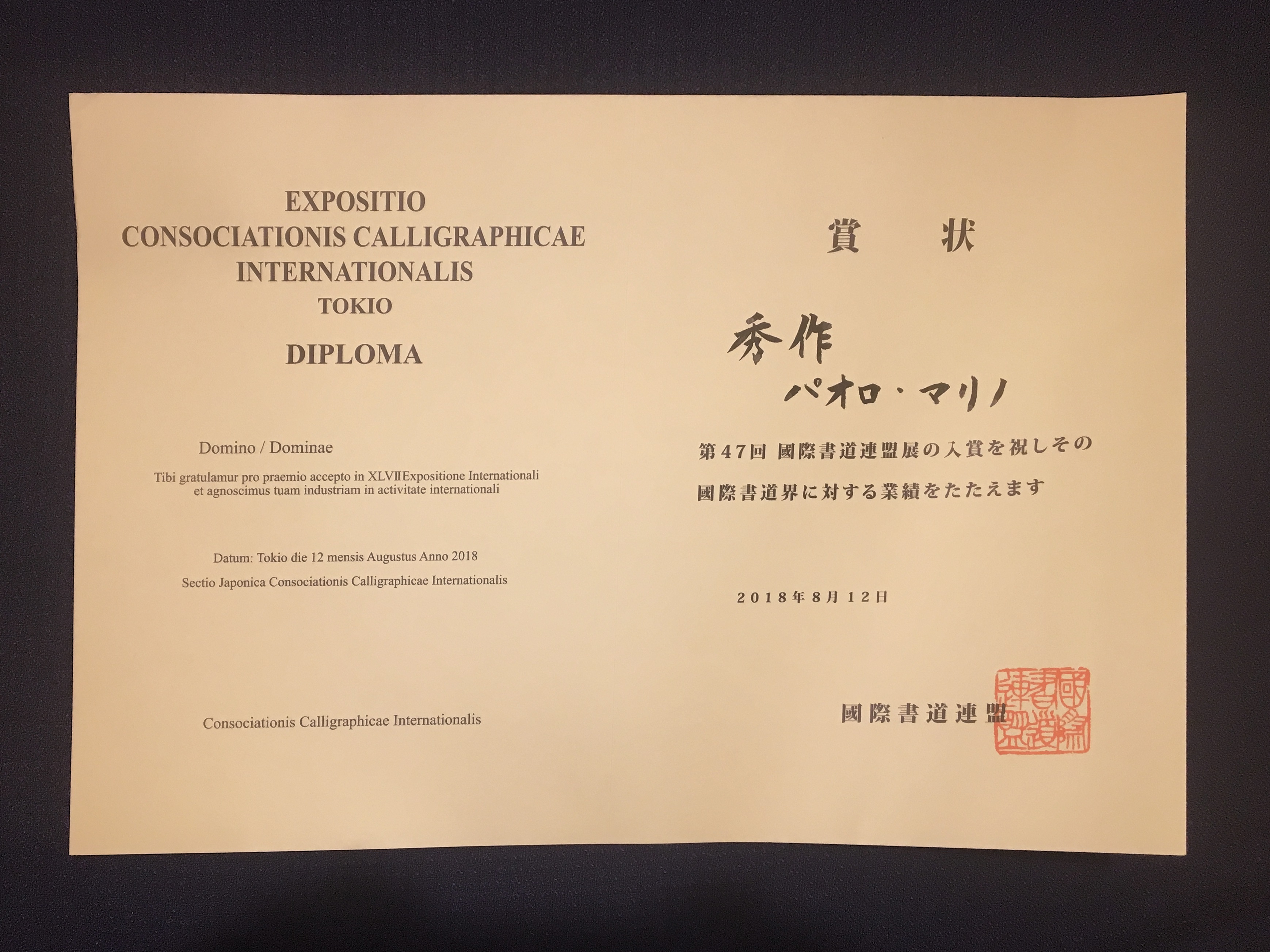
This is the diploma for "秀作賞" - i.e. Outstanding Work